Pricing Without Surprises

Growth Design2026Figma

Redesigned a subscription paywall and payment form after new legal requirements: exact prices for exact periods, auto-renewal terms on the paywall, and explicit consent at payment.

New plan cards with exact period prices and renewal terms in each card
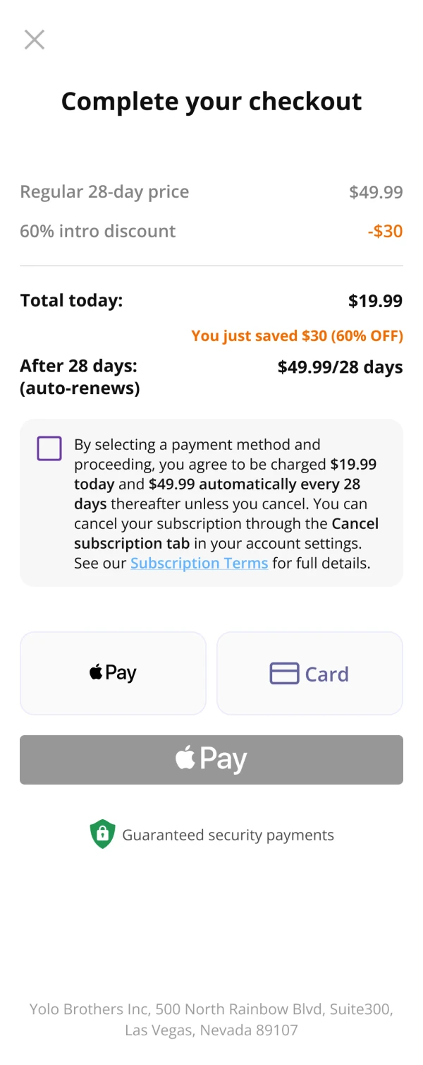
New checkout with a full price overview and a consent checkbox

Product

Nebula is an astrology and self-discovery app by OBRIO (Genesis). New users arrive through a web-to-app funnel: paid ad, landing page, quiz and email capture, then a paywall and checkout where the first payment happens.

Problem

New legal requirements hit the paywall and checkout, the most sensitive step of the funnel. Per-day pricing was no longer allowed, renewal terms had to be visible, and payment needed explicit consent.

Solution

I replaced per-day prices with the exact price for each period, wrote the renewal terms into every plan card, and rebuilt the payment form around a full price overview and a required consent checkbox with its own error state.

Result

Took legal risk off the most sensitive step of the funnel. Exact prices, renewal terms in plain sight and explicit consent made the platform feel more trustworthy to users, and monetization stayed stable through the change.

Insights

Exact price for the exact period

The old plan cards led with a per-day figure ($0.71 per day) that no one is ever billed, while the real price sat in small text under the plan name. Legal ruled per-day pricing out because it can confuse users about what they will actually pay. In the new cards the exact price for the period is the main number, and each card spells out what happens next: the first-period price, then the auto-renewal amount and how often it is charged. The renewal terms moved out of the grey legal paragraph under the button and into the plan the user is choosing.

After: plan cards led by the exact period price, with renewal terms in each card

Fig. 1 · After: exact price for the period, renewal terms in every card
A payment form that shows the whole deal

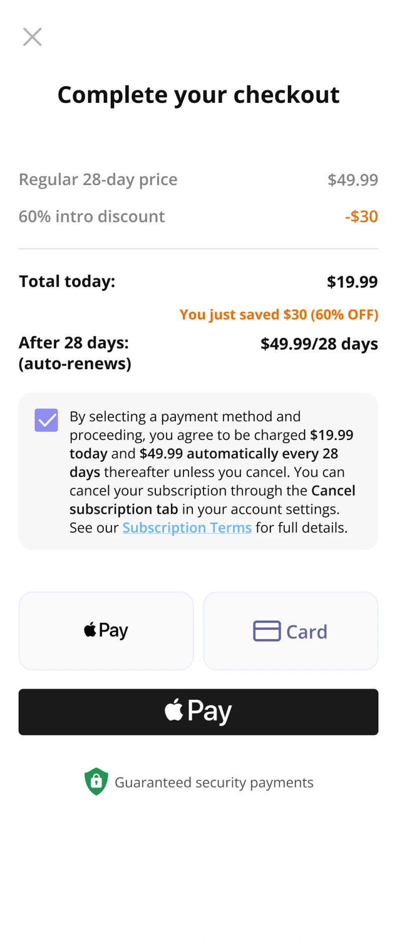
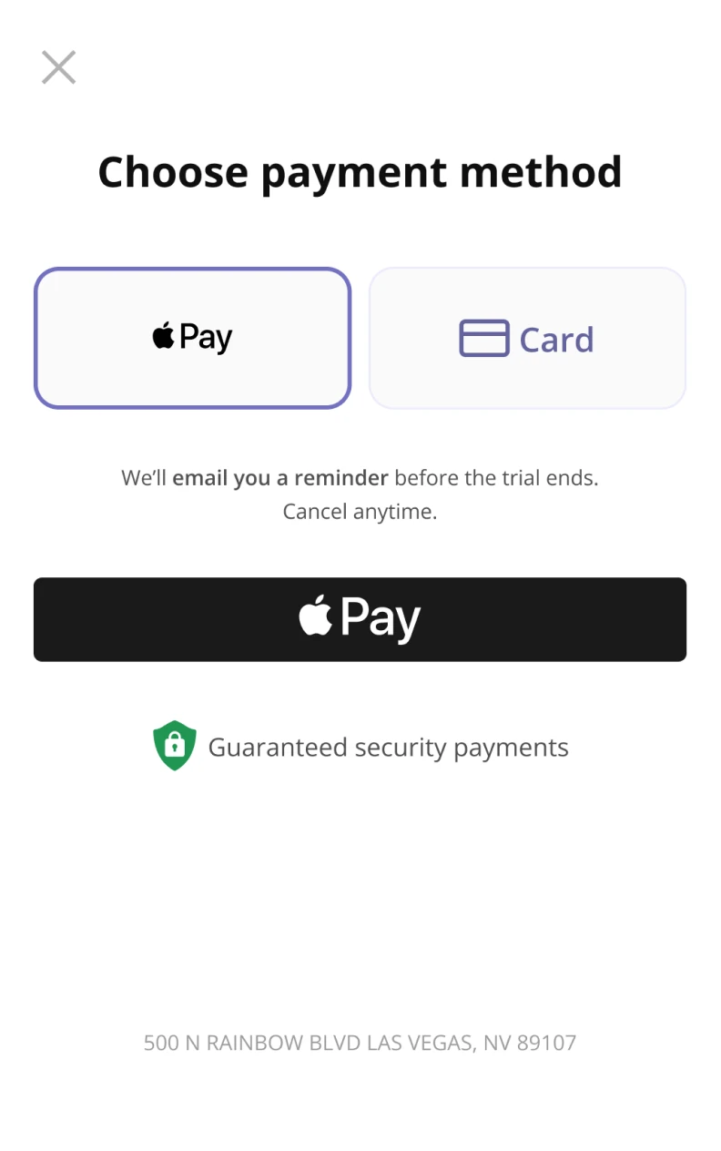
The old payment sheet went straight to choosing Apple Pay or card, with a single reminder line about the trial. The new checkout opens with a full price overview: the regular price, the intro discount, the total due today, how much the user saves, and what is charged after 28 days when the plan auto-renews. The payment terms sit right above the payment methods, before any money moves.

After: checkout with the full price overview and consent checkbox above the payment methods

Fig. 2 · After: full price overview and payment terms above the payment methods

Consent that cannot be skipped

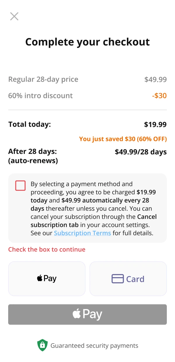
Paying now requires ticking a box that states the exact amounts and the renewal schedule. Until it is ticked, Subscribe stays disabled. If someone tries to pay anyway, the checkbox turns red and a short hint tells them what to do, instead of the payment silently failing.

Checkout with the consent box unticked and the pay button disabled

Before consent · Subscribe disabled

Checkout with the consent box ticked and the pay button active

Consent given · Subscribe active

Checkout showing the error 'Check the box to continue'

Paying without consent · error

Fig. 3 · Consent states in the payment form

Before the paywall: quiz inputs built for reuse

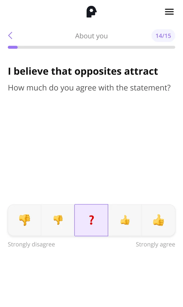
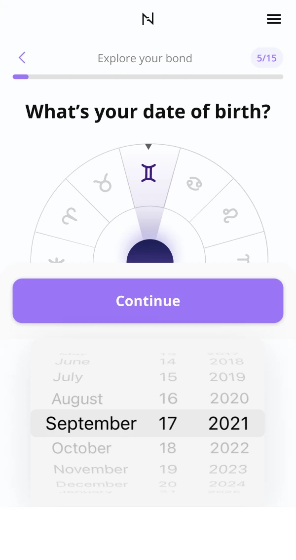
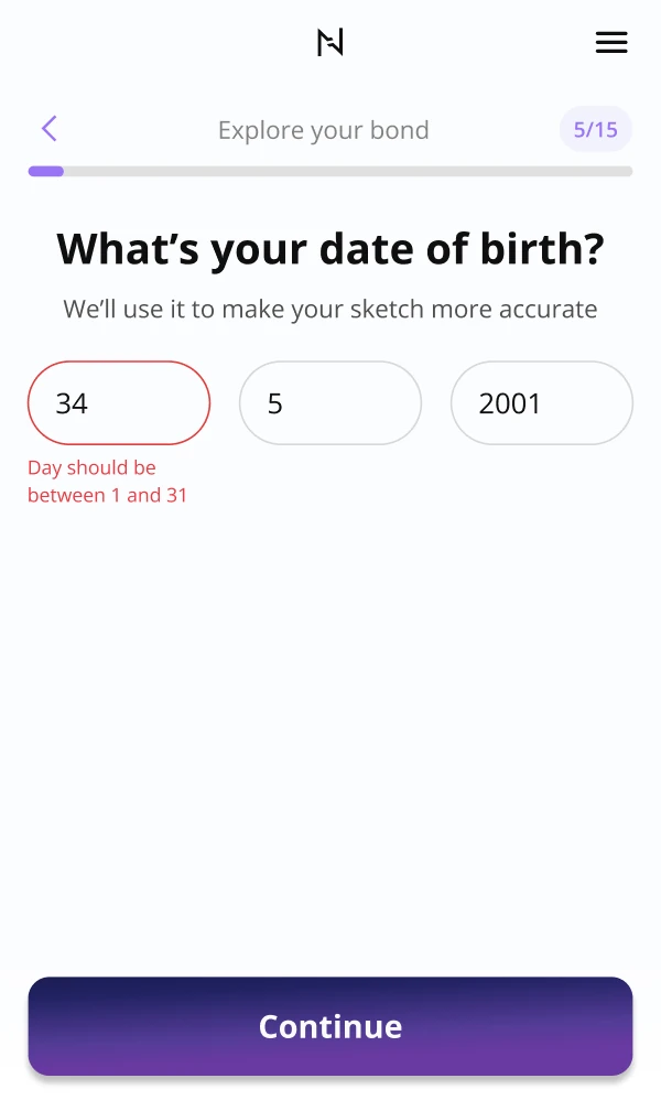
Earlier in the same funnel I redesigned two quiz inputs in the new brand as reusable components. The emoji agreement scale became a filled-track slider, which was already carried into the brand redesign: the track fills up to the chosen value, and Continue stays disabled until the user picks one. The date picker opened on a preset date (Sep 1990), so every user had to scroll away from it to find their own; it became three numeric fields (a concept, not shipped) with a number pad and auto-advance. When a value is impossible, the field turns red and says exactly what range is valid, so the fix takes one tap.

After: new filled-track slider moving between values

Agreement scale · after: the slider from the brand redesign, auto-playing

After: three numeric fields with an inline error for an impossible day

Date of birth · after: inline error, fixed in one tap

Fig. 4 · Quiz inputs, before and after

What I would test next

Compliance changed the pricing anchor, so the old winning layout is no longer a safe assumption. These are the experiments I would queue, each with a primary metric and a guardrail so a win on one number does not hide a loss on another.

HypothesisChangePrimary metricGuardrail
Without per-day anchors, the default plan matters morePre-select the 12-week plan vs the 4-week planRevenue per paywall visitorPaywall → checkout CTR
Absolute savings beat percentages“Save $30 today” vs “−60%” on the selected planPaywall → checkout CTRPlan mix

Fig. 5 · Experiments I would queue next

What I learned

Compliance changes in a funnel are conversion changes. Removing the per-day price took away the strongest anchor on the paywall, so the discount, the default plan and the savings line all had to carry more of the persuasion, honestly.

Clear terms and conversion are not opposites. Writing the renewal price into each plan card and showing the full breakdown in the payment form answers the question users would otherwise ask later, in a refund request.