← Projects

Unclutter — Website Redesign

Redesigned the marketing site for a macOS clipboard, files, and notes manager — hero carousel, UX copy, and conversion-focused pricing components.

Role UX/UI Design, UX Writing
Timeline Aug 2026
Tools Figma, Ahrefs, Claude Design

Overview

Unclutter's site had low traffic, a layout that didn't drive purchases, and copy that listed features without explaining their value, and now mobile version.

I rebuilt desktop version first, got it approved by stakeholders, then adapted for mobile, where the goal shifts from selling to building trust.

Problems & Solutions

A page can't sell if it doesn't know what it wants you to do

The old hero page had three competing buttons and no clear next step, made worse by low-contrast text burying the primary action. I removed the extra buttons so a single CTA carried the visual weight, added a sticky header to keep it reachable while scrolling, and moved social proof — media mentions — right next to the CTA instead of further down the page. Fixing the contrast issue also resolved a quiet accessibility gap.
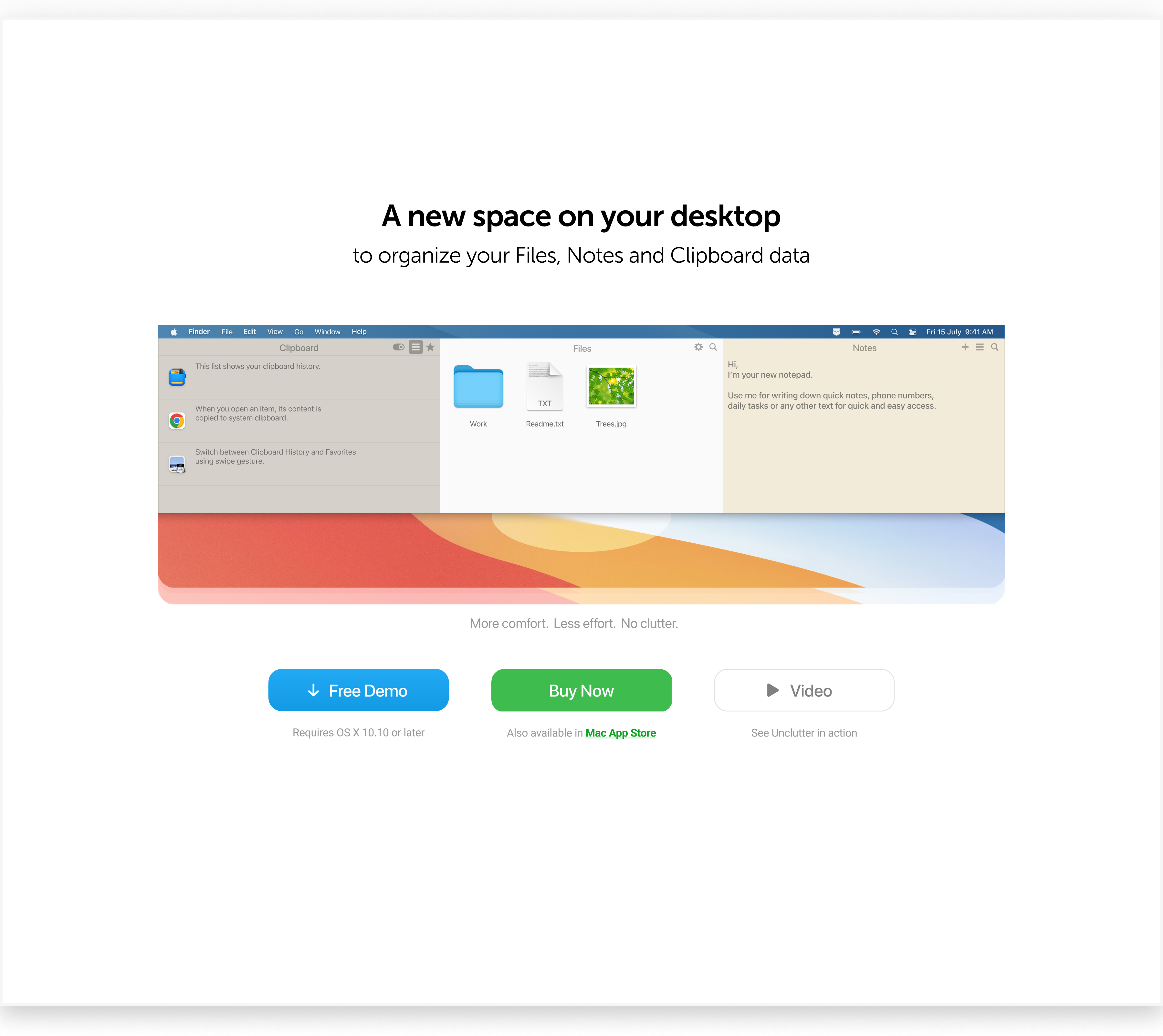
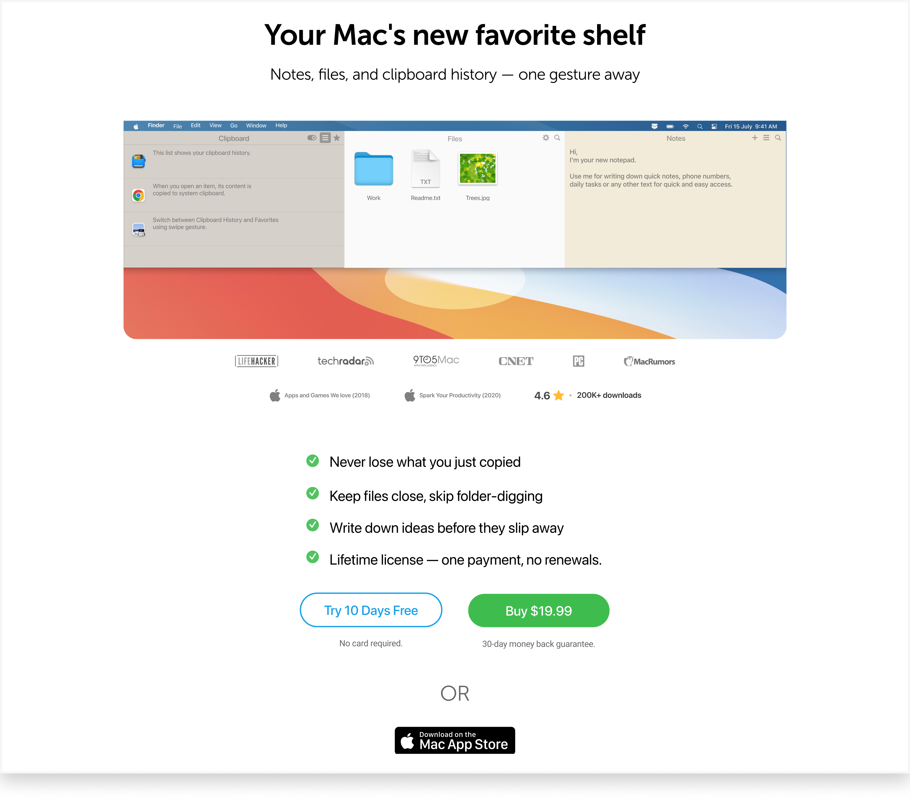
Before: 'A new space on your desktop' hero with three competing buttons (Free Demo, Buy Now, Video) After: 'Your Mac's new favorite shelf' hero with a single CTA, sticky header, and press mentions next to the button

Users don't buy features — they buy solutions

The original copy simply listed features — clipboard history, file management — without saying what any of it did for someone's day. I rewrote it in a more user-centric, emotional register, closer to how Bartender, Paste, and Ulysses talk about their own products: describing what worry the feature removes, not just what it does. The footer got reorganized, and short trust-building micro-copy went under each button.

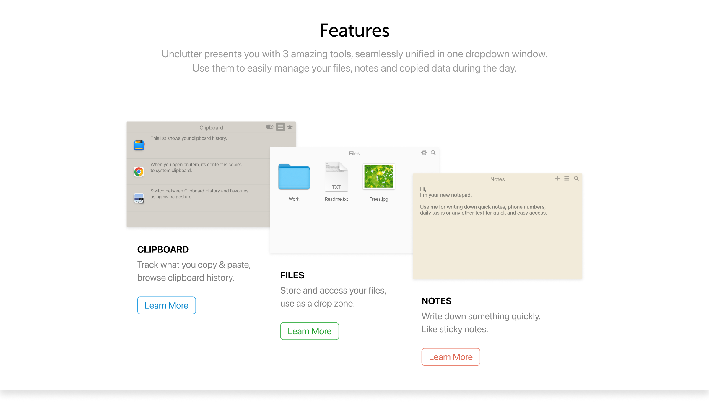
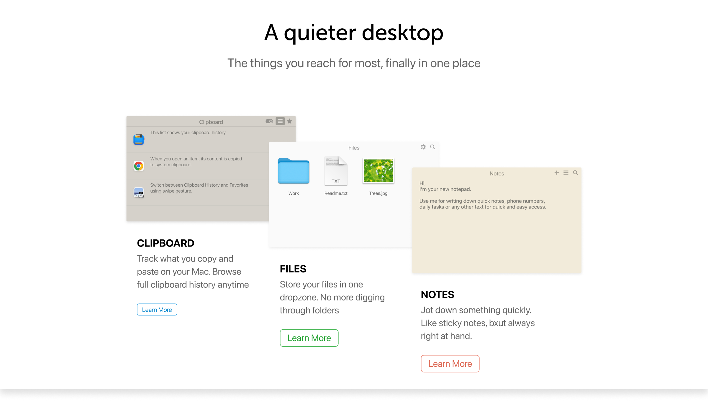
Before: 'Features' panel with generic feature descriptions After: 'A quieter desktop' panel with benefit-led, consistent copy
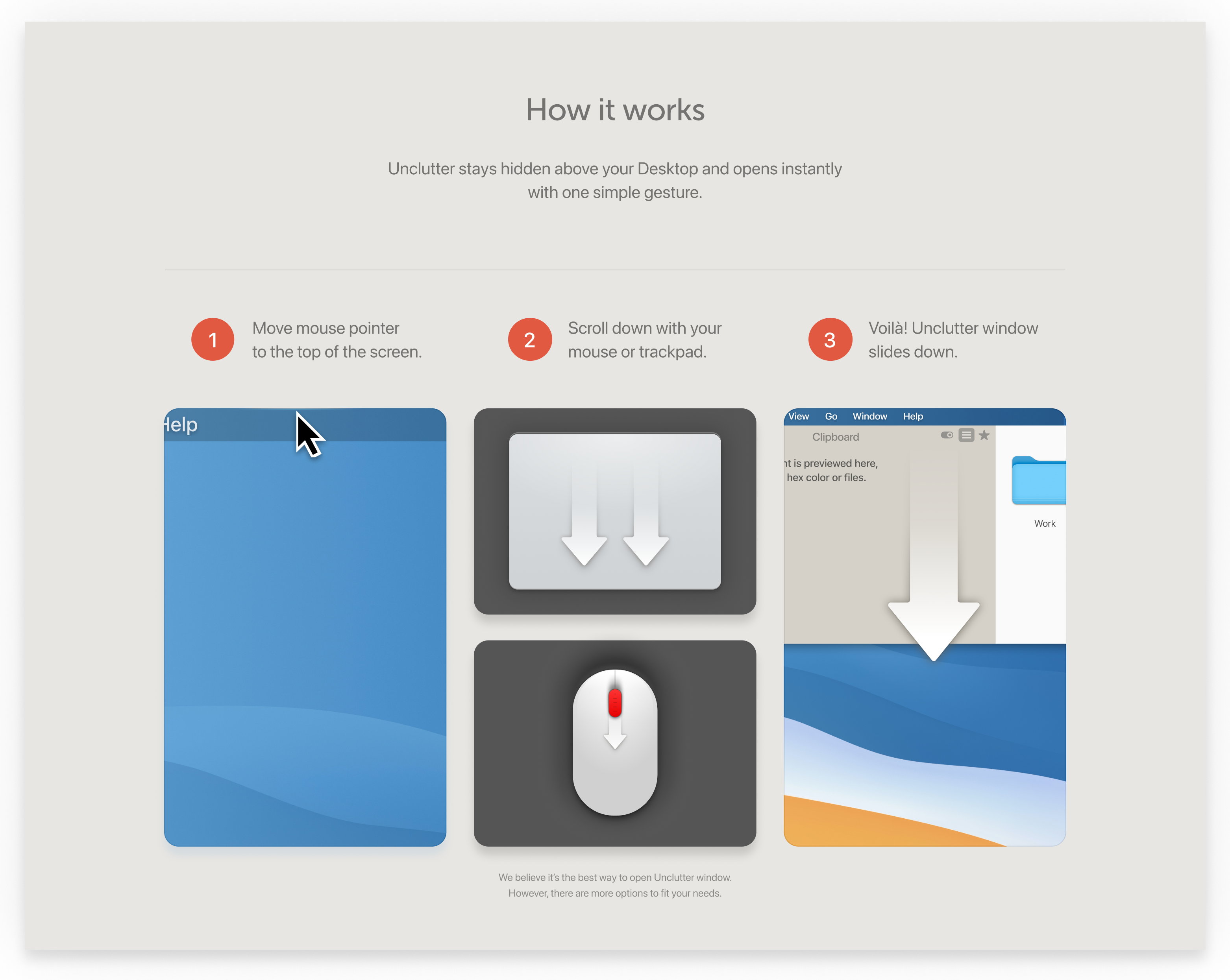
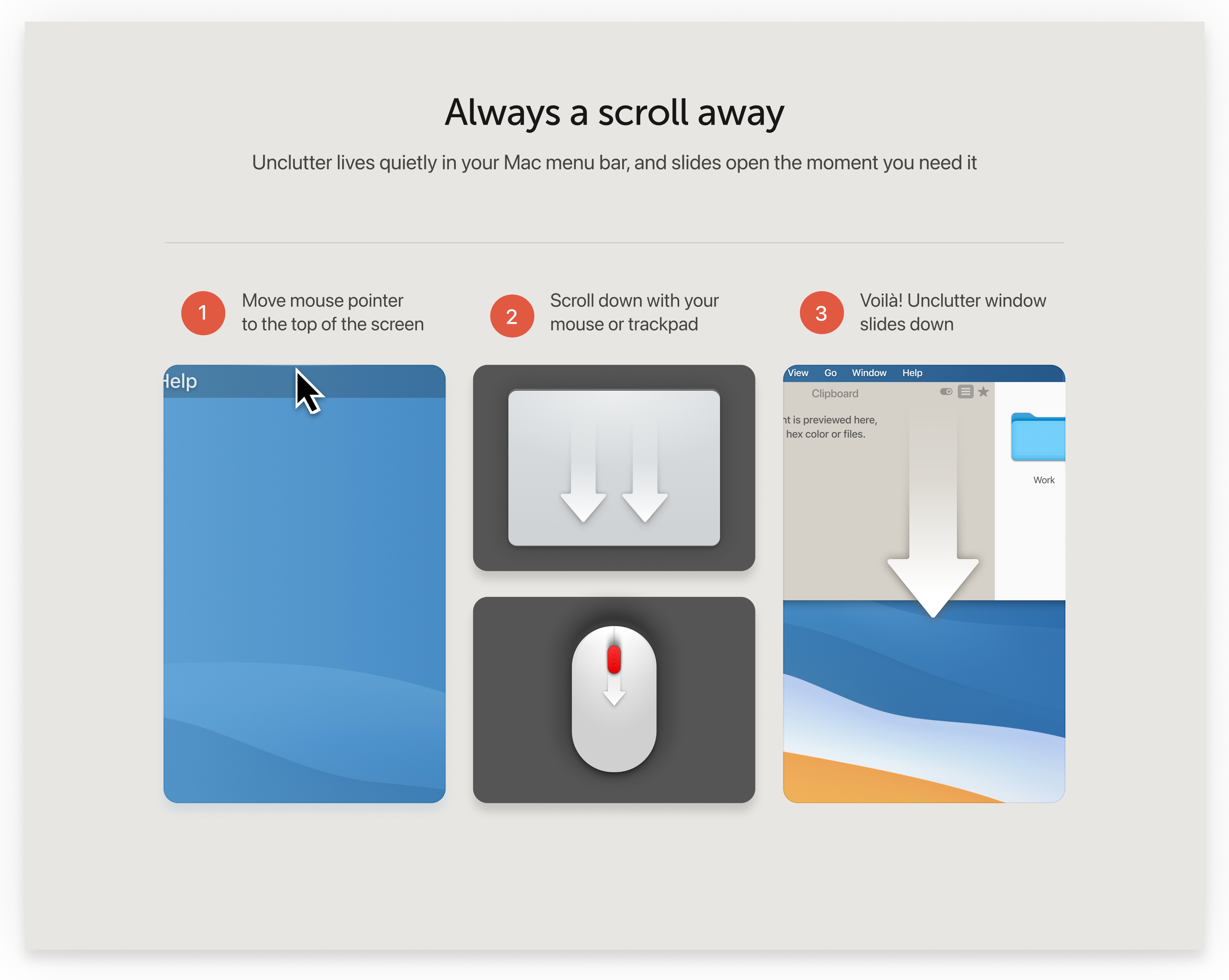
Before: generic 'How it works' three-step explainer After: 'Always a scroll away' three-step explainer with added caption

Growing traffic will cost some conversion — and that's the right trade

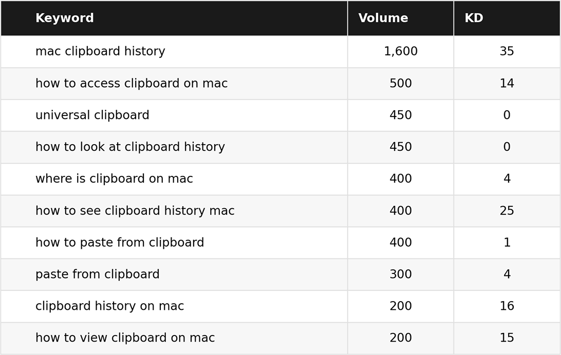
Since the website started with zero organic visibility, chasing the highest-volume terms outright wasn't realistic — a brand-new domain has no authority to compete for high-KD keywords like "paste" or "clipboard manager mac". Instead, I filtered the competitor keyword set down to a KD ≤ 35 ceiling and sorted what remained by volume, since "clipboard" was the anchor keyword throughout — it directly names the product's core value as a clipboard manager, so every term I prioritized was some variation built around it.

That filtering surfaced a clear shortlist of realistically rankable terms, which I then split by intent: short, category-defining phrases went into the H1 and homepage headline since they double as the value proposition, while the long-tail, question-phrased terms became literal FAQ questions, matching how people actually search and giving a shot at featured snippets.

Keyword shortlist with search volume and keyword difficulty for terms like 'mac clipboard history' and 'how to access clipboard on mac'

Only 16% of visitors are on mobile — so mobile's job isn't to sell

With only 16% of site traffic on mobile, optimizing for conversion made little sense — the real job was building trust so visitors would return and buy on desktop. That shift changed the layout logic: horizontal guideline blocks became vertical panels, the wide hero image turned swipeable, and reviews moved into a carousel. Button micro-copy was dropped too, since a cleaner layout mattered more than persuasion on a screen this small.

See live website